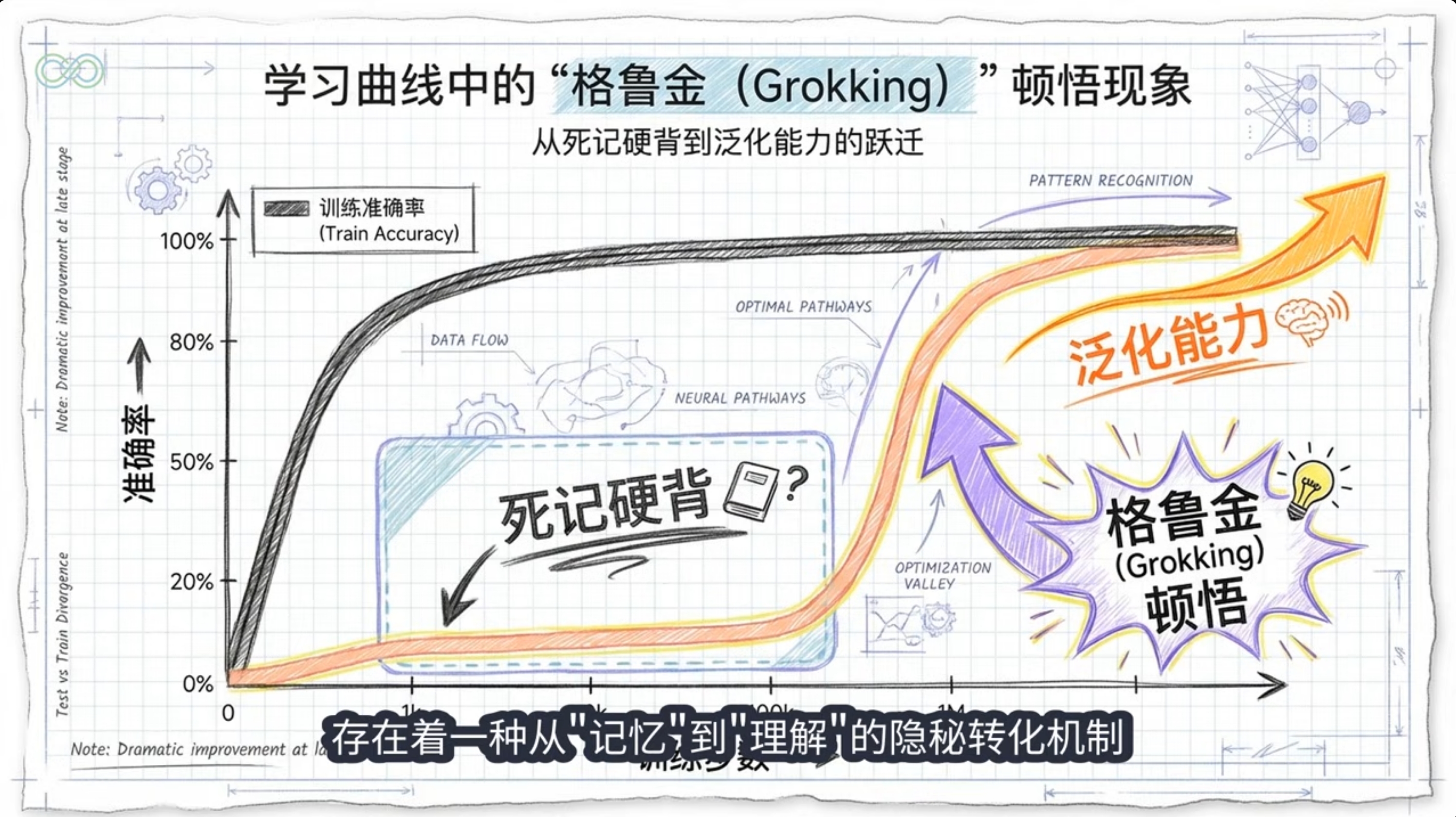
<!DOCTYPE html>
<html lang="zh">
<head>
<meta charset="UTF-8">
<meta name="viewport" content="width=device-width, initial-scale=1.0">
<title>归纳偏置在Grokking现象中的作用与机制</title>
<link href="https://fonts.googleapis.com/icon?family=Material+Icons" rel="stylesheet">
<link href="https://fonts.googleapis.com/css2?family=Roboto:wght@300;400;500;700&family=Noto+Sans+SC:wght@300;400;500;700&display=swap" rel="stylesheet">
<style>
:root {
--primary: #5e35b1;
--primary-light: #9575cd;
--primary-dark: #4527a0;
--secondary: #1976d2;
--secondary-light: #64b5f6;
--accent: #00b0ff;
--text-primary: #212121;
--text-secondary: #757575;
--background: #f5f5f7;
--card-bg: #ffffff;
--card-shadow: 0 4px 12px rgba(0, 0, 0, 0.08);
}
* {
margin: 0;
padding: 0;
box-sizing: border-box;
}
body {
font-family: 'Roboto', 'Noto Sans SC', sans-serif;
background: var(--background);
color: var(--text-primary);
line-height: 1.6;
}
.poster-container {
width: 720px;
min-height: 960px;
margin: 0 auto;
padding: 40px 20px;
background: linear-gradient(135deg, #f5f5f7 0%, #e8eaf6 100%);
position: relative;
overflow: hidden;
}
.bg-shape {
position: absolute;
border-radius: 50%;
opacity: 0.1;
z-index: 0;
}
.shape-1 {
width: 400px;
height: 400px;
background: var(--primary);
top: -100px;
right: -100px;
}
.shape-2 {
width: 300px;
height: 300px;
background: var(--secondary);
bottom: 100px;
left: -100px;
}
.grid-texture {
position: absolute;
top: 0;
left: 0;
right: 0;
bottom: 0;
background-image:
linear-gradient(rgba(255,255,255,0.05) 1px, transparent 1px),
linear-gradient(90deg, rgba(255,255,255,0.05) 1px, transparent 1px);
background-size: 20px 20px;
z-index: 0;
}
.content {
position: relative;
z-index: 1;
}
.header {
text-align: center;
margin-bottom: 30px;
padding: 20px;
background: linear-gradient(135deg, var(--primary-dark) 0%, var(--primary) 100%);
color: white;
border-radius: 16px;
box-shadow: var(--card-shadow);
}
.title {
font-size: 42px;
font-weight: 700;
margin-bottom: 10px;
line-height: 1.2;
}
.subtitle {
font-size: 18px;
font-weight: 400;
opacity: 0.9;
}
.section {
margin-bottom: 30px;
background: var(--card-bg);
border-radius: 16px;
padding: 20px;
box-shadow: var(--card-shadow);
}
.section-title {
font-size: 24px;
font-weight: 700;
color: var(--primary-dark);
margin-bottom: 15px;
display: flex;
align-items: center;
}
.section-title .material-icons {
margin-right: 10px;
color: var(--primary);
}
.content-block {
margin-bottom: 15px;
}
.block-title {
font-size: 20px;
font-weight: 500;
color: var(--primary);
margin-bottom: 8px;
}
ul {
padding-left: 25px;
margin-bottom: 15px;
}
li {
margin-bottom: 8px;
}
.highlight {
background: linear-gradient(transparent 60%, rgba(144, 202, 249, 0.4) 40%);
padding: 0 2px;
}
.card-container {
display: flex;
flex-wrap: wrap;
gap: 15px;
margin-top: 15px;
}
.card {
flex: 1 1 calc(50% - 15px);
background: rgba(255, 255, 255, 0.8);
border-radius: 12px;
padding: 15px;
box-shadow: 0 2px 8px rgba(0, 0, 0, 0.05);
border-left: 4px solid var(--primary-light);
}
.card-title {
font-size: 18px;
font-weight: 500;
color: var(--primary-dark);
margin-bottom: 8px;
display: flex;
align-items: center;
}
.card-title .material-icons {
font-size: 18px;
margin-right: 8px;
color: var(--primary);
}
.visual-container {
margin: 20px 0;
text-align: center;
}
.visual-caption {
font-size: 14px;
color: var(--text-secondary);
margin-top: 8px;
font-style: italic;
}
.footer {
margin-top: 30px;
padding: 15px;
text-align: center;
font-size: 14px;
color: var(--text-secondary);
background: rgba(255, 255, 255, 0.6);
border-radius: 12px;
}
.reference {
font-size: 12px;
margin-bottom: 5px;
}
.phase-diagram {
display: flex;
justify-content: space-between;
margin: 20px 0;
position: relative;
}
.phase {
flex: 1;
padding: 15px;
text-align: center;
position: relative;
}
.phase-title {
font-weight: 500;
margin-bottom: 10px;
color: var(--primary-dark);
}
.phase-desc {
font-size: 14px;
}
.phase-arrow {
position: absolute;
top: 50%;
right: -15px;
transform: translateY(-50%);
color: var(--primary);
font-size: 24px;
z-index: 2;
}
.phase:last-child .phase-arrow {
display: none;
}
</style>
</head>
<body>
<div class="poster-container">
<div class="bg-shape shape-1"></div>
<div class="bg-shape shape-2"></div>
<div class="grid-texture"></div>
<div class="content">
<header class="header">
<h1 class="title">归纳偏置在Grokking现象中的作用与机制</h1>
<p class="subtitle">从记忆到泛化的相变过程解析</p>
</header>
<section class="section">
<h2 class="section-title">
<i class="material-icons">lightbulb</i>
引言:Grokking现象简介
</h2>
<div class="content-block">
<p>Grokking是指神经网络在训练集上完全过拟合后,经过长时间继续训练,突然在验证/测试集上实现快速泛化的现象。</p>
<ul>
<li><span class="highlight">典型特征</span>:训练损失快速下降后停滞,测试准确率长时间随机水平后突跃</li>
<li><span class="highlight">原始发现</span>:2022年OpenAI论文《Grokking: Generalization Beyond Overfitting on Small Algorithmic Datasets》</li>
<li><span class="highlight">关键条件</span>:数据有限、强正则化、过参数化模型、超长训练</li>
</ul>
</div>
</section>
<section class="section">
<h2 class="section-title">
<i class="material-icons">psychology</i>
归纳偏置与Grokking
</h2>
<div class="content-block">
<p><span class="highlight">归纳偏置定义</span>:学习算法对解空间的先验假设,使模型偏好某些函数而非其他</p>
<div class="phase-diagram">
<div class="phase">
<div class="phase-title">早期阶段</div>
<div class="phase-desc">优化器隐式偏置或大初始化偏向"记忆解"(kernel regime)</div>
<div class="phase-arrow">
<i class="material-icons">arrow_forward</i>
</div>
</div>
<div class="phase">
<div class="phase-title">晚期阶段</div>
<div class="phase-desc">权重衰减或优化器后期偏置转向"最小范数/最大边际解"(min-norm/max-margin)</div>
<div class="phase-arrow">
<i class="material-icons">arrow_forward</i>
</div>
</div>
<div class="phase">
<div class="phase-title">相变结果</div>
<div class="phase-desc">早期偏置导致过拟合,晚期偏置导致泛化,形成尖锐相变</div>
</div>
</div>
</div>
</section>
<section class="section">
<h2 class="section-title">
<i class="material-icons">build</i>
机制解释
</h2>
<div class="card-container">
<div class="card">
<div class="card-title">
<i class="material-icons">electrical_services</i>
电路竞争理论
</div>
<p>记忆电路vs泛化电路,权重衰减偏好更简洁的泛化电路。记忆电路在压缩大数据集方面效率低,而泛化电路有更大的固定成本但更好的每样本效率。</p>
</div>
<div class="card">
<div class="card-title">
<i class="material-icons">trending_down</i>
复杂度动态
</div>
<p>记忆阶段复杂度上升,泛化阶段复杂度下降。适当正则化的网络表现出尖锐的相变,而未正则化的网络则被困在高复杂度的记忆阶段。</p>
</div>
<div class="card">
<div class="card-title">
<i class="material-icons">speed</i>
数值稳定性
</div>
<p>Softmax Collapse导致梯度停滞,继续训练突破后突发更新。超过过拟合点后,梯度与"朴素损失最小化"(NLM)方向强烈对齐。</p>
</div>
<div class="card">
<div class="card-title">
<i class="material-icons">surfing</i>
梯度冲浪
</div>
<p>正则化使最小损失点集合更易于导航。在没有正则化的情况下,SGD不能轻易地在相同损失点之间移动,正则化释放了神经网络在损失盆地中"冲浪"的能力。</p>
</div>
</div>
</section>
<section class="section">
<h2 class="section-title">
<i class="material-icons">smart_toy</i>
在LLM中的表现
</h2>
<div class="content-block">
<ul>
<li><span class="highlight">异步局部Grokking</span>:不同数据域异步进入grokking阶段,泛化在损失收敛后仍提升</li>
<li><span class="highlight">隐式推理</span>:transformer通过Grokking学习隐式推理能力,如组合和比较推理</li>
<li><span class="highlight">系统性泛化</span>:不同推理类型的泛化水平不同,组合推理的泛化能力低于比较推理</li>
</ul>
<div class="visual-container">
<img src="https://sfile.chatglm.cn/moeSlide/image/5a/5a14a0c2.jpg" alt="Grokking训练动态图" style="max-width: 100%; border-radius: 8px;">
<p class="visual-caption">Grokking训练动态:训练损失与测试准确率随时间变化</p>
</div>
</div>
</section>
<section class="section">
<h2 class="section-title">
<i class="material-icons">new_releases</i>
最新研究进展
</h2>
<div class="content-block">
<ul>
<li><span class="highlight">电路效率理论</span>:Varma et al. (2023)提出泛化电路逐渐胜过记忆电路是因为效率差异</li>
<li><span class="highlight">复杂度相变</span>:DeMoss et al. (2024)引入基于率失真理论的复杂度测量框架</li>
<li><span class="highlight">数值稳定性视角</span>:Prieto et al. (2025)发现Softmax Collapse阻止Grokking,并提出StableMax激活函数</li>
<li><span class="highlight">隐式推理机制</span>:Wang et al. (2024)揭示transformer通过Grokking形成"泛化电路"实现隐式推理</li>
</ul>
</div>
</section>
<section class="section">
<h2 class="section-title">
<i class="material-icons">tips_and_updates</i>
应用与启示
</h2>
<div class="content-block">
<div class="card-container">
<div class="card">
<div class="card-title">
<i class="material-icons">tune</i>
训练优化
</div>
<p>调整初始化规模、权重衰减与优化器,监控电路/秩演化作为Grokking指标。适度延长训练并加强正则化,可能诱导更好泛化。</p>
</div>
<div class="card">
<div class="card-title">
<i class="material-icons">precision_manufacturing</i>
效率提升
</div>
<p>利用归纳偏置提取与匹配策略优化提示工程。使用Adam等自适应优化器并延长训练,结合合适正则化诱导更好泛化。</p>
</div>
</div>
</div>
</section>
<section class="section">
<h2 class="section-title">
<i class="material-icons">summarize</i>
结论
</h2>
<div class="content-block">
<p>归纳偏置是Grokking机制的核心驱动力:训练早期隐式/显式偏置倾向记忆化解(快速拟合),晚期偏置(如权重衰减驱动的最小范数、电路效率,或优化器Slingshot)转向简洁泛化解,导致从过拟合到延迟泛化的尖锐相变。2023-2025研究证实阶段二分偏置可严谨证明Grokking,并在LLM中表现为局部异步现象,为理解涌现能力提供新视角。</p>
</div>
</section>
<footer class="footer">
<div class="reference">Varma et al. (2023). Explaining grokking through circuit efficiency.</div>
<div class="reference">DeMoss et al. (2024). The Complexity Dynamics of Grokking.</div>
<div class="reference">Prieto et al. (2025). Grokking at the Edge of Numerical Stability.</div>
<div class="reference">Wang et al. (2024). Grokked Transformers are Implicit Reasoners.</div>
<div class="reference">Doshi et al. (2024). To Grok or not to Grok: Disentangling Generalization and Memorization.</div>
</footer>
</div>
</div>
</body>
</html>